There are more than 200 million active websites on the internet. As a business owner, what does that mean for you? One word: competition.
Now more than ever, you have to do everything you can to stand out from the crowd.
One great way to do this is by having a website that truly works. You want your site to be irresistible to your target market. Good design will make that happen.
But sometimes it can be hard to know where to begin! That’s why we’ve gathered 6 website design principles that will help you. Check them out below.
1. Have a Clear Purpose
When designing your website, don’t start designing right away. You first need to think through the marketing strategy.
What’s the purpose of your site? Do you want it to:
- Sell products?
- Attract leads?
- Provide entertainment?
- Gather email addresses?
Whatever the purpose, it’s important to decide the goal of your site.
Once you’ve decided the overall goal, it’s now time to think about the purpose of every single page.
A contact us page, for example, has a clear purpose. You want people to either call or email you after visiting it. Another example is your pricing page. It should give people information about your pricing options and encourage them to buy.
Every time you go to make a page, ask yourself what its purpose is. This will make your site much more effective.
. . . . . . . .
2. Utilize Simple Forms
Next on the list is to optimize your site’s forms. These days, forms are a common part of most websites.
Here are some examples:
- A registration form for an insider’s club
- A sales form to purchase your product
- A contact form to get a question answered
- A request a call form to schedule a call with a sales rep
- A newsletter subscription form to register for an email list
With any of these forms, you want to make it as simple as possible to fill out while still gathering the information you need. This is what makes forms a little tricky.
You don’t want people to abandon your forms but you have to get the necessary information. It’s a delicate balance!
For example, while it may be nice to get a user’s phone number so you can call them in the future about products, you really only need their name and email address for an email subscription form.
One way around this is to make some fields mandatory and others optional. That way you don’t lose people but also will gather additional contact information from others.
If you’re not sure how visitors will react to your form fields, test it out! Perform some A/B tests over a few weeks and see what works best.
. . . . . . . .
3. Add This to Your List of Website Design Principles: Have a Great About Us Page
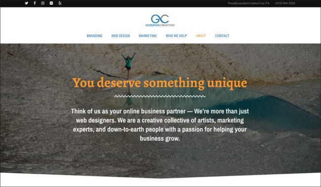
When trying to improve the effectiveness of your site, don’t forget about your About Us page. Too often, companies don’t have one or don’t put much effort into it.
But keep in mind that potential customers visit About Us pages to see if they can trust your company.
They want to know who you are, what you do, and why you do it. Oftentimes, they also want to know how long you’ve been in business and want to read customer reviews.
Have specific certifications or training? Also, include this information. Basically, consider your About Us page a chance to prove yourself to your future customers.
You’ll find that a strong About Us page will improve your site overall.
4. Your Site Should Be Mobile Friendly
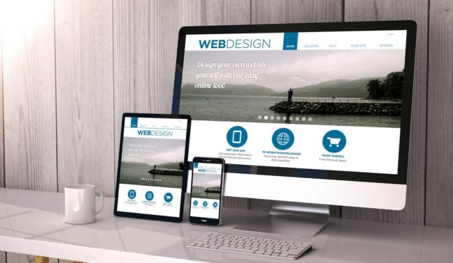
In today’s digital world, people use their tablets and smartphones to access the internet all the time. So if your site performs poorly on these platforms, you’re in trouble. In fact, this is one of the biggest things you should focus on when designing your site.
If your site doesn’t look good on every screen, you will lose traffic, which also means you’ll lose out on sales or leads.
But if you’re not a developer, it can seem impossible to make a site that fits every single screen out there. The good news is that there are responsive site builders.
A responsive site is great because it automatically resizes itself to fit on any screen, including televisions, desktops, tablets, and phones. And you don’t have to code a different site for each one. It’s done for you!
Interested in professional web design services that will look great on every screen? We can help with that.
. . . . . . . .
5. Font Problems
Remember that your site is meant to fulfill a specific purpose. If all it does is look nice, but doesn’t perform well, that’s a bad sign.
Often, fonts are a source of this problem and get in the way of successful website design. This is because designers sometimes choose fonts that look beautiful but are really hard to read.
Cursive or handwritten fonts, for example, are great to look at but sometimes impossible to decipher, especially on smaller screens.
Remember that you want your users to be able to easily consume the information on your site. It shouldn’t be a chore for them.
Instead, pick unique but still readable fonts. Also, don’t use too many. A good rule to follow is to only use two or three fonts at most throughout your entire site.
. . . . . . . .
6. Your Website is Slow
Here’s a fact you should know. A study by Google found that 46% of people say that the thing they dislike most about browsing the web on mobile devices is waiting for pages to load.
So if your site is slow, users will bounce.
This means that they click away from your site before or very soon after arriving. When Google sees this, your page ranking goes down. The bottom line is that faster pages perform better.
. . . . . . . .
What Do Potential Clients Look For in a Therapist’s Website?
When someone in search of therapy visits a therapist’s website, they come with specific expectations and concerns that mirror the principles of effective website design. For these potential clients, clarity is paramount. They want a website that clearly outlines the therapist’s approach, areas of expertise, and the problems that can be addressed through therapy. Well-designed websites for therapists should effortlessly guide visitors towards the information they need regarding therapy services and what to anticipate during sessions.
Easy navigation is crucial in both contexts. Clients desire a website that provides straightforward contact options and simplified scheduling processes. The website’s structure should mirror the intuitive design of a well-organized webpage, ensuring that visitors can find essential details without frustration. Trust-building becomes paramount, akin to the trust an effectively designed website seeks to inspire. The therapist’s “About Us” page should offer insights into their background, qualifications, therapeutic approach, and client testimonials, helping clients establish a sense of trust and connection.
Additionally, just as a responsive website adapts to various devices, therapists should ensure their websites are mobile-friendly. Many clients access therapist websites on their mobile devices, and a responsive design ensures accessibility and user-friendliness, irrespective of the device used. Finally, readability is as vital as it is in website design. Clients expect clear and legible fonts to effortlessly digest the information presented on the therapist’s site. By embracing these principles from a client’s perspective, therapists can create websites and intro videos that effectively meet their clients’ needs, fostering trust and encouraging them to take the step towards seeking therapy services.
What’s Next?
Now that you’ve read through these website design principles that will make your site more effective, what’s next for you?
It’s simple! It’s time to try them out. And if you need help with your web design project, contact our team of experts. We’d love to help.


