It’s no secret you need a high-performing website to succeed as a business these days. Regardless of whether you run a small coffee shop or you’re trying to build a large clothing company, much of your success depends on how well you can market yourself.
You can’t ignore the power of digital marketing.
The internet connects you to consumers in a much more personal, direct manner than any print ad or SMS campaign can do. But, you have to know how to use it.
This means understanding how to make your website look professional, how to draw more people to your site, and how to turn visits into conversions. Such concepts may sound like a lot to take on, but it’s manageable to do when you have the right insights.
For tips on luxury website design, check out the advice available below.
Clean up the Basics
What’s the first thing you notice when you visit a new website? Maybe you’re off-put by how long it takes the homepage to load or you’re frustrated with an outdated mobile design that doesn’t work on your phone.
These are a few of the basics worth paying attention to. Things like load times, mobile responsiveness, and SEO are considered standard design tools. Overlooking them sets you back significantly when trying to create a professional website.
. . . . . . . .
Load Time
Every page on your website should take no longer than 2-3 seconds to load. In fact, 3 seconds is pushing it.
You want the load time to be as fast as possible for your audience.
This makes it easier to hook them once they actually see what’s on your homepage and other landing pages, like the prelaunch landing page for subscriptions. Making them wait longer for the page to load loses their interest. It results in higher bounce rates and fewer conversions.
Video by SEO link builder Julian Goldie
. . . . . . . .
Mobile Responsiveness
Here’s another thing to keep in mind: mobile search has surpassed desktop. In other words, more people are browsing the web from their smartphones and tablets than from behind a computer screen. These are consumers in your market you can’t afford to lose.
It’s crucial for you to have the right mobile web design to connect with them.
The best way to do this is with a responsive website. Responsive design allows you to have one URL that does it all. With this, your website will automatically fit any screen it appears on whether it be a large computer or a small phone. Everything from the menu bar to the images and graphics is simple to understand and easy to use.
. . . . . . . .
On-Site Optimization
SEO is a complex part of web design to understand. But, it’s imperative you learn about on-site optimization and pay attention to your SERPs if you want your website to succeed.
Professional web design is not just a matter of looking good. You also have to think about the way the internet works and how traffic is driven in order to place your stunning design in front of more users.
. . . . . . . .
Invest in Quality Visuals
Once you have all the basics figured out, it’s time to take your web design efforts to the next level. Think about the kind of visuals you want to have on your homepage to draw users in, and all the other photos, videos, and graphics the rest of your website needs.
Here are a few things to consider as you implement visuals into the design process.
. . . . . . . .
Say No to Cheesy-Looking Stock
There’s nothing professional about using bad stock photos for your website. If anything, it says you’re too lazy to get professional pictures done of your business, or that you don’t want to invest in high-quality stock photography.
It’s always better to use real-life shots of your staff, your office environment, and your products.
Not only does it show your attention to detail and help you impress your audience, but it helps your brand come to life.
Stock photos are generic. Custom-made photos, videos, and graphics are one-of-a-kind creations; they’re on-brand and much more impressive than any stock image can be.
. . . . . . . .
Create Movement
It’s not enough to have custom images if you don’t know what to do with them. There should be a clear strategy behind every visual you use and where it’s placed.
Think about everything from which action buttons create the most conversions and which photos/videos best hook users.
A great strategy to use is to create movement. Elegant websites aren’t stagnant. They have graphics that move, videos that start to play automatically, and user interactions that feel natural. There’s a flow that happens as users scroll through the homepage, navigate the menu bar, and click on internal links.
How to Make Your Therapist Web Design More Professional
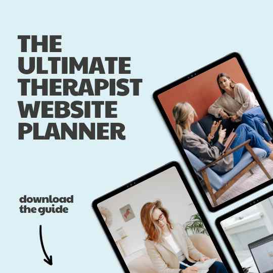
Creating a professional therapy website involves several key elements to establish trust and showcase your expertise effectively. Start with a clean and modern design that’s visually appealing and easy to navigate, avoiding clutter and distractions. The best websites for therapists use high-quality, relevant imagery and maintain consistent branding throughout your website.
Craft well-written, error-free content that explains your therapy approach and services clearly, adopting a friendly yet professional tone. Incorporate authentic client testimonials and make it easy for visitors to schedule appointments. Emphasize client privacy and data security, especially if you offer online therapy, and provide helpful resources on mental health topics. Ensure mobile responsiveness, keep your website up-to-date with fresh content, and display your professional affiliations and certifications.
Regularly engage with a blog or news section to position yourself as an expert in your field. By focusing on these aspects, you can create a therapy website that exudes professionalism, attracting clients seeking your expertise and support.
Choose Custom Over Template
The final piece of advice to consider is to always choose a custom design.
There are plenty of easy-make web platforms out there which allow you to make your own website with a template. As simple as this process may be, the results are underwhelming.
Instead of a stunning, unique website, you end up with something that resembles what many other companies already have. It’s hard to stand out with such a design, and even more difficult to be memorable.
These are a few reasons why custom website design is always the way to go. Sure, the process is a little longer and there are many details to consider.
The final result is a true testament to what luxury website design should be.
When you create a site from scratch, you’re able to decide everything from the sitemap to the navigation controls. You develop the UX and UI little by little, making everything come together as seamlessly as possible.
The result? A beautiful, well-branded professional website; something sure to attract users and keep them coming back for more.
. . . . . . . .
How to Make Your Website Look Professional: Consult the Experts
The silver lining to creating a custom website is that you don’t have to do it alone. Instead of learning all the ins and outs of how to make your website look professional little by little, you can contact a team of experts who create stunning websites every day.
A team like us. Goodman Creatives offers a full-scale web design service. We help you through everything from identifying your ideal client to generating unique designs to optimizing your website.
For more on how our process works and the results available, contact us today!


