Your company’s website provides current and potential customers with important information. What do people want to know? Among other things, they want to know about you.
Your “about us” page is as important as any other part of your website.
It tells people who they’re dealing with and why they should continue. How do you create a killer “about us” page? Start by including the 5 W’s.
- Who are you?
- What do you do?
- When did you start doing what you’re doing?
- Where are you?
- How are you accomplishing what you claim to do?
Need more inspiration? Then check out these 7 amazing examples of successful website about us pages.
1. Yellow Leaf Hammocks
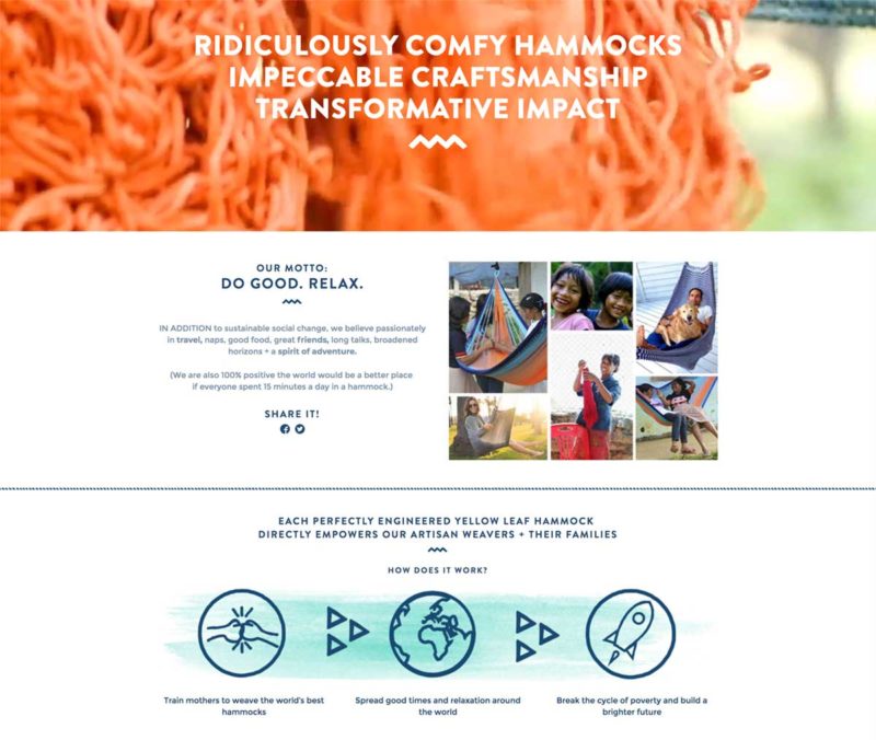
The website for Yellow Leaf Hammocks provides a great “about us” page to learn from. What makes this page so awesome? It reads like a storybook.
Instead of focusing on the here and now, this page lets people delve into the history of the company. They get to learn all about how the company came to be and the good that’s come from it.
Do you have a great story to tell?
Whether you come from humble beginnings or not, you’ve worked your way to this point. Or you have a dream you’re trying to realize.
Whatever your story is, make it known. People will appreciate it. The more comfortable they are with you, the more comfortable they’ll be using your services.
2. Tumblr
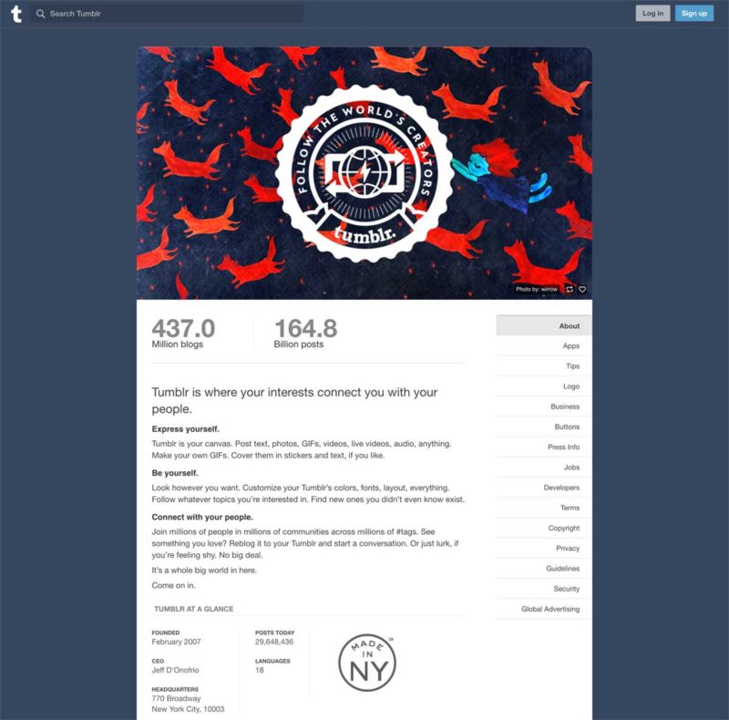
Tumblr takes a very different approach on their “about us” page. Instead of providing a history they focus more on the present.
You’re welcomed by an attractive, changing hero image. This grabs attention and adds color without making the page too busy.
As you scroll down you learn some basics about the company and what you can do on their site.
Tumblr’s approach offers information that people will find interesting while keeping things simple. It only takes a glance to learn some basics about the company.
You don’t have to stop at the basics, though. If you keep scrolling you’ll see some of the latest posts. Directing visitors to your current and recent content is a great way to get them involved in the rest of your site.
3. Band
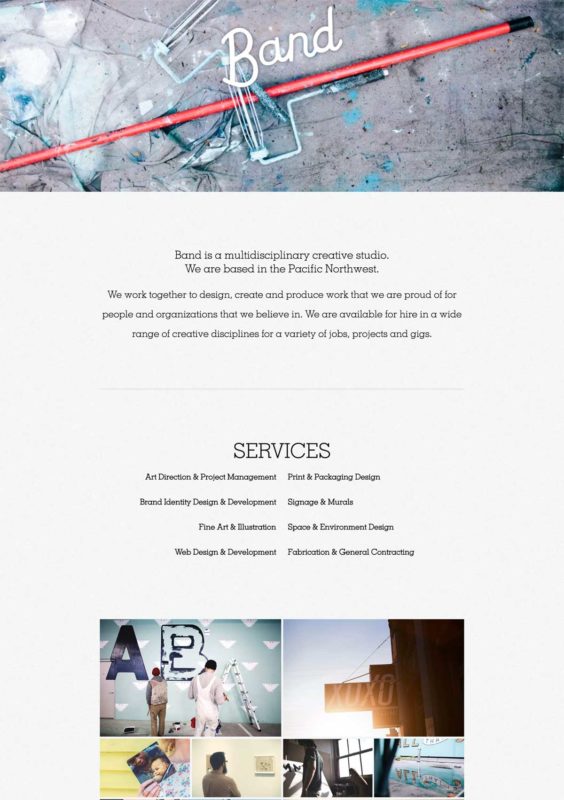
This site covers the basics while showing the company’s flare. From the very beginning, you’re pulled in by their interesting and unique hero image.
As you scroll down, the user experience is smooth and flawless, sending you right on to the next section each time. This is something important to notice.
Visuals aren’t everything, performance is important too!
This “about us” page tells readers all about the services offered as well as the history of the company. And it keeps them engaged with lots of compelling images.
On top of that, they provide contact information. Perfect.’
4. Salemtown Board Co.
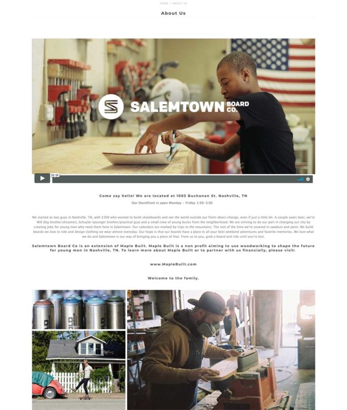
Right up front, Salemtown Board Co. tells you all about the company, thanks to the bar along the top of their site. Once you get into the “about us” details, it’s just as good.
Right smack-dab in front of you is a video followed by the store’s location and hours. The video offers vibrant colors as a still image and visitors stick around to view the video.
Having the contact info plainly in view is brilliant. There’s no doubt about where and when you can go to see them in action.
As you cruise through the rest of the page you’re greeted by information about the company and pictures of their products. You also get a glimpse into the board creation process. Taking visitors behind the scenes makes them feel like guests rather than customers.
This “about us” page offers a perfect combination of details that any visitor would appreciate.
5. Nerdery
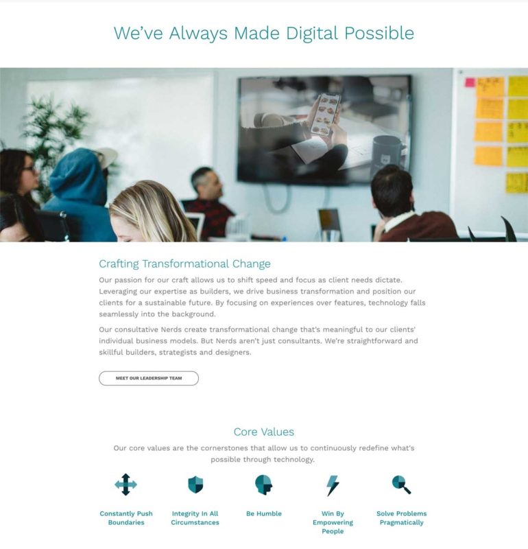
This “about us” page offers simplicity and interest all in one beautiful package. Lots of white space cuts back on clutter and your eyes know where to go.
While the text and imagery are limited, you’ll learn all about Nerdery and what they stand for. Their use of icons to represent their core values is great. You get a short and to-the-point description of who these people are.
On this page, you’ll also find a link to more info about the company’s leadership, and the foundation they’re a part of.
6. Moz
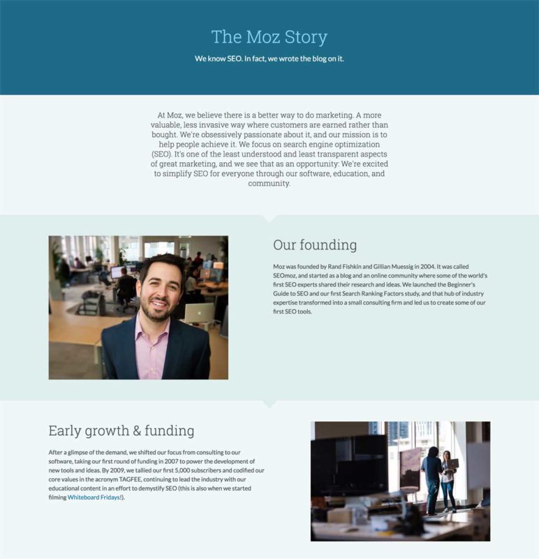
Moz tells their story through little segments all placed on one page. Consider them micro-views into the chapters of the company’s story.
When you first land on this page you’re greeted with utter simplicity. No images or graphics, only words and a couple of background colors. While it’s not as flashy as other sites, it grabs attention for being different.
As you scroll down, though, you’re greeted with images and text, all arranged in a creative, attractive fashion.
You learn about the company’s values, founding, and growth as you travel through the page. By the time you’re done, you know exactly who you’re dealing with, and it was a pleasure to find out.
Some company’s like to shout about their accomplishments. Moz lets you get to know them without being in your face.
7. Goodman Creatives
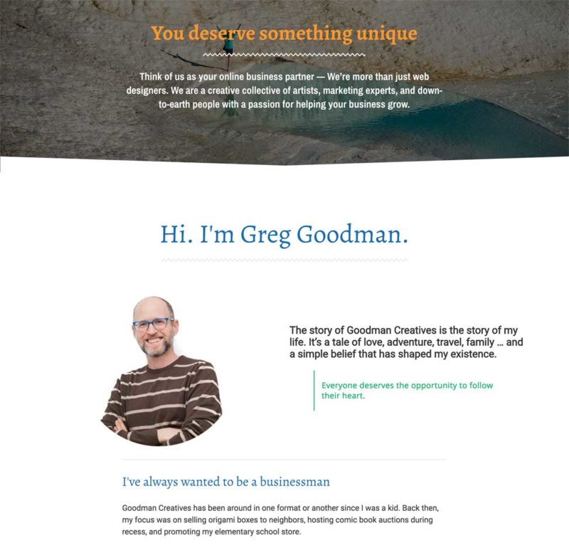
Yes, I shamelessly added my own about page to this list. Why? Because it takes you on an adventure through my life.
When you work with Goodman Creatives, you work with me: Greg Goodman. Sure, I have an amazing team behind me – but what stands out most to my clients is the personal touch that I provide. That’s why my about page starts with a powerful “you statement” and a brief description of the company, before jumping into how Goodman Creatives came to be. If you keep reading, you’ll learn more about how I help make websites for therapists.
Fun fact – the beautiful woman in the header photo is my wife, Carrie, doing yoga on a trip to Turkey.
You Need an “About Us” Page
When you’re dealing with a company, you like to know a little bit about them, right? So does everyone else. That’s why people will want to get to know you.
An “about us” page is a perfect way to let the public get familiar with your company. Don’t let your website go without one. If you don’t have one, start designing one today!
Not sure where to start? We’d love to help you out! Contact us today to see what we can do for you.

