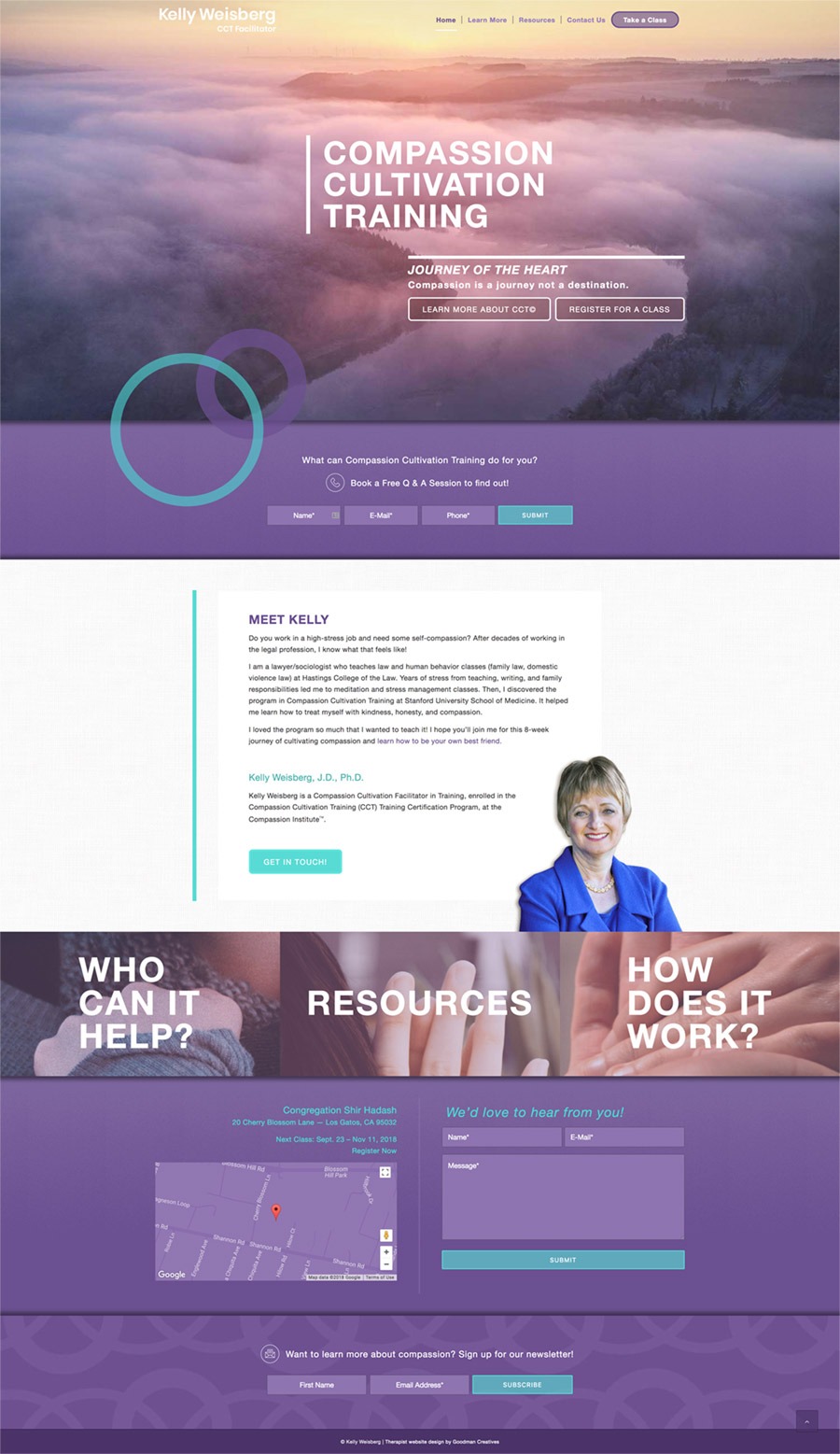
With a request for a teal and purple color pairing, we set out to create a space of compassion.
Throughout the site, there are hands showing gestures of kindness and empathy. We felt that cropping this kind of expression in people’s hands really exemplified humanness. Subtly the few landscapes used are pictured in sunset, lightly touching upon the idea that at the end of the day what matters is the quality of your interactions and contributions.
Since this is a training & resources site, the simple navigation funnels the user to engage with registering for a class.
First, they learn what CCT is, who it benefits, and then how it works encouraging them to take action. Thus having ample white space to read through the more informational content. The last element, are varying linked circle graphics overlaid onto the main images headers.
These also abstractly represent connection and cultivating a compassionate relationship with others in their overlap. Overall the layout is clear, graphic and communicative.