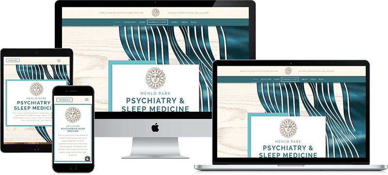
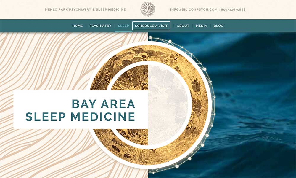
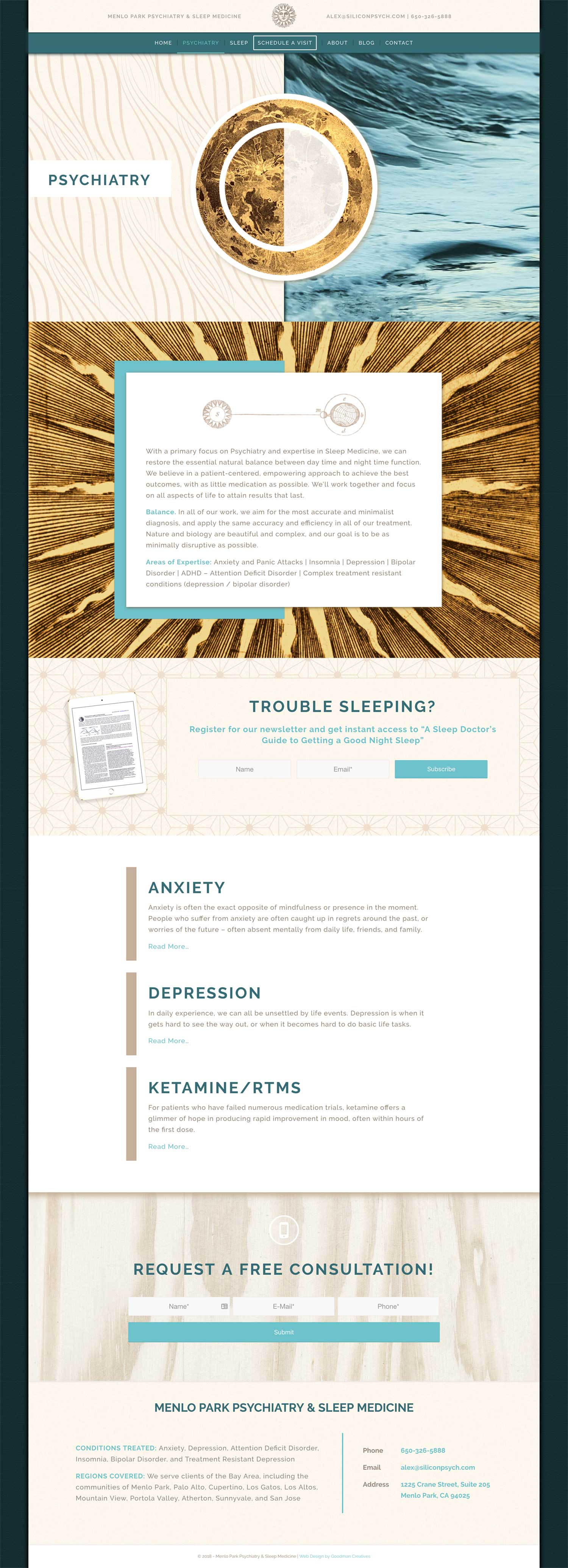
With a Mid-Century aesthetic, illuminated color scheme and modern treatment of content, along with a few natural elements like water and wood, we designed Menlo Park Psych to incorporate a symbolic cycle under the sun and moon, which represents the practice’s specialty in sleep medicine.
The day and night visuals also expand on their existing vintage illustration of a sun logo, giving the design character at which we built off of. We used soft texture, sophisticated portraits and accented vintage celestial illustration to further the overall visual concept of their business, where psychiatry should feel welcoming and approachable for the person seeking help.
The blue hues of water give the audience a subconscious feeling of calm and compassion, while the varying waves double as a representative of emotion, fluidity and the changing weather of the human psyche, being quite natural.
Also, with most of the panels having a half and half orientation, this plays on the idea of a day and night cycle, again subtly staying in theme, beyond the animated graphic of a moon constellation. We further wanted to iterate simple navigation and visually bold site function by leading you into the site with two main categories of therapy offered, Psychiatry (Day) and Sleep Medicine (Night).
This concept further embellishes their mission to provide therapy in support of a healthy balance of that cycle, customized to the individual.
Working with Greg has been an amazing experience from start to finish.
He offers artistry and technical expertise to create some truly beautiful and functional sites. Great ideation and interaction overall as well!
Alex Dimitriu, MD
Founder of Silicon Psych
Before & After
Use the slider to explore the old and new versions of the Silicon Psych website.