[vc_row type=”in_container” full_screen_row_position=”middle” scene_position=”center” text_color=”dark” text_align=”left” overlay_strength=”0.3″ shape_divider_position=”bottom” bg_image_animation=”none”][vc_column column_padding=”no-extra-padding” column_padding_position=”all” background_color_opacity=”1″ background_hover_color_opacity=”1″ column_link_target=”_self” column_shadow=”none” column_border_radius=”none” width=”1/1″ tablet_width_inherit=”default” tablet_text_alignment=”default” phone_text_alignment=”default” column_border_width=”none” column_border_style=”solid” bg_image_animation=”none”][vc_column_text]
Small business owners jump through marketing hoops to get website visitors.
However, many people forget that getting someone to your website is just the first step. When your dream client ends up on your landing page, you want them to do something.
The last thing you want is for them to merely take a peep and leave because they found your webpage uninspiring. You want your clients excited and curious, so they will hit the sign-up button, request more info, or click on your other tabs.
To motivate your audience to explore your page, you must find ways to entice your audience to stay. To achieve success in drawing your audience to use your site, you need to work on your CRO or conversion rate optimization.
Defining CRO (Conversion Rate Optimization)
CRO is a pretty comprehensive process that includes a lot of elements such as your website’s speed, your landing page design, your website copy, your site structure, and your overall user experience.
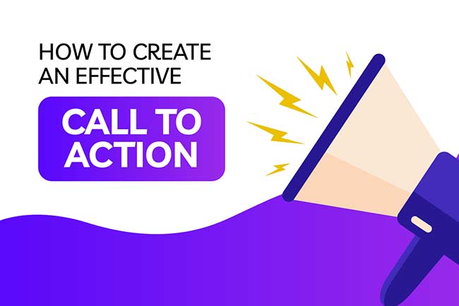
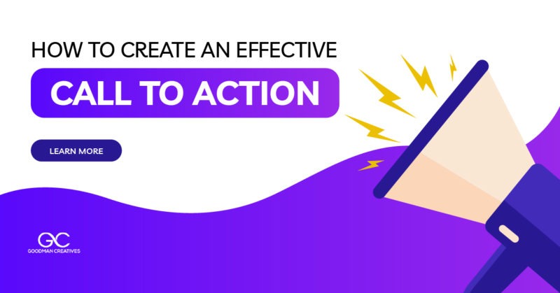
However, the most essential component of CRO is the Call to Action. This is also known as the CTA. It has the power to generate a lot of leads.
You generate leads through a high marketing funnel, and they have a significant potential to bring more revenue to your business.
What is a CTA (Call to Action)?
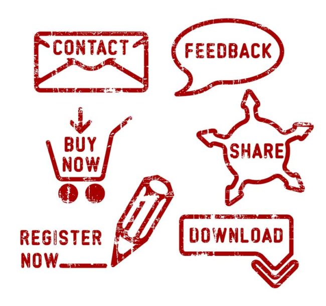
Its name speaks for itself! As the term says, a Call to Action is a request or call for your customers to perform the desired action. You want them to do something concrete when they reach your website.
This is the most critical part of your website copy because it guides your audience and tells them what action they can do next. The action this term refers to can be any of the following:
- Press the Click Here button
- Subscribe to your newsletter
- Request additional information
- Join your program
- Book a slot in your webinar
- Buy something
- Avail of a service and more
It is critical to spend a lot of time crafting your CTA because your calls to action have the key to turn your leads into conversion. This means driving traffic to your site and motivating people to do something concrete.
Thus, you need to make sure you are doing the best CTA practices. You must optimize everything from the words you put, the color of the buttons, where you place them, etc.
Planning is essential, so you don’t waste your time, money, and effort. On top of that, evaluate your CTA graphics and words. Change is necessary for those that do not work and are ineffective.
How to Optimize Your CTA
Because the World Wide Web (WWW) can be unpredictable; it is not always possible to determine what CTA will click (pun intended). However, there’s no harm in trying to follow the recommended best practices, which have worked for many others out there.
These optimization strategies have the potential to give you the best start. Follow these suggestions to increase traffic and get your fair share of the market. Consider some of the following practices below:
Brevity is Key
Don’t beat around the bush and stick to the point. Keep your CTAs short and sweet. In general, CTAs that are long and tedious become ineffective.
If you observe the most successful CTAs, they are around four words long. They contain powerful verbs that inspire movement. Some examples are: join now, sign up, buy me, subscribe now, and the like.
Emphasize the Urgency and Scarcity
People act faster when they feel a sense of urgency. It is critical to emulate the same feeling for your CTA.
In line with this, creating a feeling of scarcity also does the trick because it pushes your audience to be more decisive about their actions. After all, no one wants to bypass a great deal.
To illustrate, use the following: limited time only, shop now, last chance, promo ends tomorrow, sign up now, etc. All of these are great CTAs because it motivates your audience to make a firm decision, or they will be unable to take advantage of your offer.
Explore the Perks of Reverse Psychology
You’ve probably encountered this strategy at least once in your life. Usually, it comes in the form of a pop-up. It has become prevalent in the past couple of years because it is effective.
The idea of reverse psychology is offering two choices to push your website visitor to action. This boosts your website traffic and conversion rates. However, these choices go beyond the simple yes or no.
If you’re an informative blog and you’re urging your clients to subscribe, instead of giving the normal subscribe button, the choices are: continue receiving great info or miss updates. No one wants to miss out!
Customize Your CTAs
Personalizing and customizing your CTAs have the power to boost your conversion rates by an astounding 200%. Clients like seeing their names on tabs like Click Here, John, or Welcome Back, Jenny.
It is beneficial to use your available data to adjust your CTA copy. You can tailor-fit your words to suit your user’s location, their status as your client, and other similar factors.
Use a Design That Stands Out
Around half of your traffic is browsing your site and viewing it from a mobile gadget. Use a web design that helps you stand out against your competitors. Use a responsive design that adjusts based on the device used.
The material on your website must be easy to read, even in small screens, so that you can keep your clients’ elusive attention. This strategy is even more critical for your CTA.
Double-check your CTAs appearance and their placement on a variety of screen types before you publish. You don’t want anyone to miss and skip your CTAs. Make them visible and clear by using contrasting colors and your white space.
Turn Them into a Button
Your CTA can be an ordinary hyperlinked text, a picture, or some other graphic. However, site owners report that buttons work the best. The reason is the human brain expects action once they press a button.
Buttons are tempting. When you see a button in real life, you have the urge to press it. Experiment with button designs and colors. Choose the one that best matches the theme of your page.
Make Sure Your Landing Pages Work
It is useless to have compelling CTA if you have broken landing pages. It is vital to click on all your CTAs to make sure they work.
Check if all the links and forms are in proper working order. Nothing annoys a client more than seeing a 404 page or an error page.
When to Change Your Call to Action
If your conversion rates are sluggish, it is time to evaluate if there is a need to change your CTA. One small mistake can lose you a significant lead in a matter of seconds. Consider changing under these scenarios:
Doesn’t Grab Attention
If your CTA doesn’t stand out and grab attention, change it immediately. Try using contrasting colors for your landing page and CTA button. This makes your button more pronounced.
It is time to steer clear of a monochromatic pattern. When it comes to a CTA button, you need it to pop out. You must ensure that your Learn More or Schedule an Appointment button demands attention to help you optimize conversions.
Size Matters
The size of your CTA matters because it is the most significant feature on your landing page. If it is too small because you fear to be too pushy, clients can miss it. You want a prominent CTA button they can see.
Remember, a larger button commands more attention and is easier to read. However, you don’t want this button to occupy more than half of your page either. You don’t want to put too much pressure.
The best size is large enough to see but small enough to be modest.
Too Vague
Steer clear from vague buttons like Click Here or Submit Now. With lots of malware and hackers roaming the web, your clients want to know what will happen if they click something.
Your CTA buttons need to establish authority. Above all else, they must be clear and straight to the point. You want to show straight away how they will benefit from your button.
They must understand your message clearly in a matter of seconds. An action statement like Download My Free E-book or Being My Free Trial works wonders.
Wrongly Placed
If you place your CTA at the bottom of your page, there is a high chance they will not see it. Make it easy for your users to convert by placing your CTA buttons in a prominent spot.
Put them above to catch your viewers’ eyes. You want them to see your CTA immediately without needing to scroll down. Studies also say that CTAs on the right generate more clicks as opposed to CTAs that are on the left.
Overloading on Multiple Buttons
Having too many CTA buttons on one page can distract your clients. It is critical to give them a concrete path of action. Steering your audience all over the place is counterproductive as it can minimize conversion.
Do not bombard your users with too many CTAs that have different goals like Download eBook, Subscribe Now, and Watch My Podcast. It is best to have a clear conversion goal.
A Download eBook button at the top, along with a picture of a clickable eBook at the bottom of your page, is an example of a CTA that works toward the same goal. Consistency is critical to avoid confusion.

Download a copy of The Ultimate Business Website Planner
(see, that’s one of our CTAs – you can download it here)
Test Your CTA
It is unrealistic to expect that you’ll find the perfect CTA in an instant. This is an ongoing process that continually changes and evolves depending on the market trends and needs of your clients.
Thus, it is necessary to test and continually improve your CTA. Be abreast of trends and pay close attention to what your audience likes.
A/B testing helps figure out which CTA works best.
You split your audience in half and show two groups of different versions of your CTA. Of course, you keep the method that generates the most conversion for your site.
Hold off on changing many elements at once because you don’t want to alienate existing clients. Instead, gradually change and compare different variables like words or copy, CTA placement, color, and the like.
Some site owners who have the budget use technology in testing their CTAs. There is now software that relies on AI (artificial intelligence), which automatically optimizes your existing CTAs. They base this on real-time interactions of your site visitors.
This software requires a bit of investment, but it is useful in creating the most optimal CTA. You get quicker results and can craft better plans than traditional testing.
Bottom Line
A strong Call to Action is critical to your landing page. This is an instrumental factor in your website’s success. Optimize your CTA to generate leads and increase your conversion. When a potential lead arrives on your landing page, you want them to notice your CTA and take the appropriate action.[/vc_column_text][/vc_column][/vc_row][vc_row type=”in_container” full_screen_row_position=”middle” bg_color=”#f2f2f2″ scene_position=”center” text_color=”dark” text_align=”left” overlay_strength=”0.3″ shape_divider_position=”bottom” bg_image_animation=”none” shape_type=””][vc_column column_padding=”padding-4-percent” column_padding_position=”all” background_color_opacity=”1″ background_hover_color_opacity=”1″ column_link_target=”_self” column_shadow=”none” column_border_radius=”none” width=”1/1″ tablet_width_inherit=”default” tablet_text_alignment=”default” phone_text_alignment=”default” column_border_width=”none” column_border_style=”solid” bg_image_animation=”none”][vc_column_text]
Need help with CTAs?
[/vc_column_text][divider line_type=”Full Width Line” line_thickness=”1″ divider_color=”extra-color-1″ animate=”yes” custom_height=”33″][vc_column_text]Our expert team has decades of experience crafting the perfect CTAs. Schedule a free 15-minute Q&A call to learn how we can help your business grow.[/vc_column_text][divider line_type=”No Line” custom_height=”33″][nectar_btn size=”large” button_style=”regular” button_color_2=”Accent-Color” icon_family=”default_arrow” url=”https://goodmancreatives.com/schedule-a-call/” text=”schedule a FREE Q&A Call”][divider line_type=”Full Width Line” line_thickness=”1″ divider_color=”extra-color-1″ animate=”yes” custom_height=”88″][vc_column_text]
Reach out Today
[/vc_column_text][divider line_type=”No Line” custom_height=”33″][vc_raw_html]JTNDZGl2JTIwY2xhc3MlM0QlMjJfZm9ybV8zNyUyMiUzRSUzQyUyRmRpdiUzRSUzQ3NjcmlwdCUyMHNyYyUzRCUyMmh0dHBzJTNBJTJGJTJGZ29vZG1hbmNyZWF0aXZlcy5hY3RpdmVob3N0ZWQuY29tJTJGZiUyRmVtYmVkLnBocCUzRmlkJTNEMzclMjIlMjB0eXBlJTNEJTIydGV4dCUyRmphdmFzY3JpcHQlMjIlMjBjaGFyc2V0JTNEJTIydXRmLTglMjIlM0UlM0MlMkZzY3JpcHQlM0U=[/vc_raw_html][/vc_column][/vc_row]