Think about the mindset of a potential new therapy client. Maybe they have been considering therapy for some time now. Or, maybe something reached a boiling point last night and they realized it was time to finally reach out and ask for help.
Odds are, this vulnerable individual has been visiting quite a few websites for therapists looking for the right fit. After a while, all the sites seem to blend together. So, what differentiates your practice from all the others? What makes them contact you instead of the therapy group practice down the street?
Quite often, the difference between a successful intake and a lost lead can be how easy you make it to get in touch.
That’s why it’s essential to have a contact form on every page of your site. Preferably, the form will be in a prominent part of the page with a clear call to action. That said, it’s better to have a simple and unobtrusive contact form at the bottom than to have no form at all.
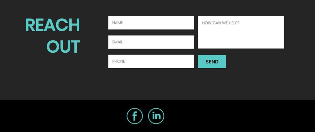
Why you need a contact form on every page of your therapist website.
When someone fills out your psychotherapist website contact form, they are giving you access to their most valuable communication method: their inbox. From an outreach and therapist marketing perspective, this is a goldmine … so make sure to give your visitors plenty of ways to get in touch.
Research shows that nearly 50% of contact form submissions come from a page other than the contact page.¹
That means if the only form on your therapy site is hiding on the contact page, you’re only getting half the leads you could be getting.
4 shocking statistics about converting leads from your therapist website:
- If you follow up with web leads within 5 minutes, you’re 9 times more likely to convert them.
- 50% of leads are qualified but not yet ready to buy.
- At any given time, only 3% of your market is actively buying. 56% are not ready, 40% are poised to begin.
- 65% of a company’s new business is from referrals.²

It’s not enough to just list my email address
No! When a potential client clicks on an email address, it has to open a new window or app to send that email. There are a dozen things that can go wrong in the transition or distract the user … each of which will cost you a potential new client. Plus, it’s inconvenient.
Filling out a contact form requires the bare minimum of effort. Yet, the person is still making an emotional commitment to learning more.
. . .
Include multiple contact forms on every page of your therapy practice website
Therapist contact forms in all shapes and sizes. Many therapy sites include in-depth contact forms. This is great for a contact page or a “book an appointment” page. However, if this is the only way to reach out, it can alienate potential patients who are not as far along in the decision-making process. Many people just want to learn more about the process and aren’t ready to commit to anything.
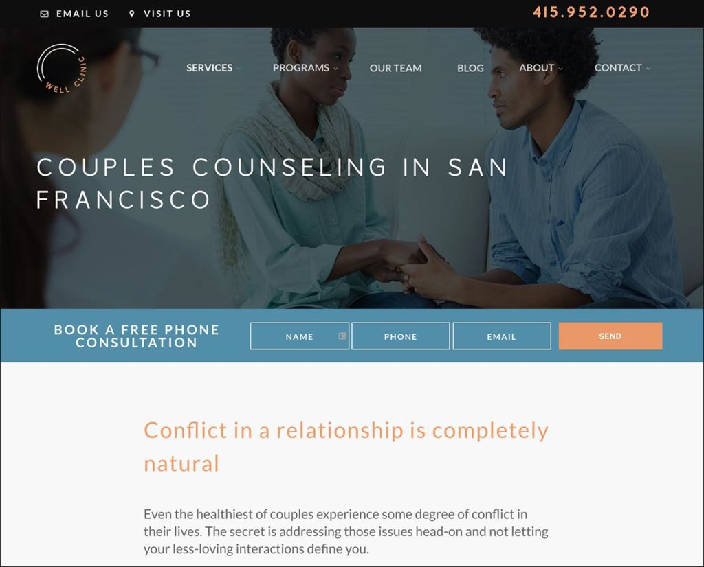
Later in the page, we include a second contact form. It’s very similar to the first, except it adds in an extra question: “how can we help you.”
Finally, users who reach the actual contact page are presented a series of questions, including their specific issue(s), the best time to get in touch, and what clinician they would like to reach.
As you might imagine, the free consultation form is the most frequently used method of contact. It’s also the way the company gets the most leads.
. . .
How to add more contact forms to your psychotherapy website
That’s where Goodman Creatives comes in! With two decades of experience helping therapists get more intake calls from their websites, we’re here to help.
Reach out today and schedule a free consultation to discuss contact forms, marketing, and anything else you need. Think of it as a therapy session for your therapist website.
Here’s a contact form to get you started 🙂

