Everyone needs a website …
A place away from the dings and distractions of social media.
Somewhere that inspires people to know, like, and trust you.
Whatever marketing you do, all roads should point back to WWW.
Perhaps I’m biased.
After all, I’ve been designing websites for 25 years.
And, I believe that a website is THE KEY to standing out in a busy online crowd.
A website is the single most important piece of your marketing puzzle.
Keep reading to find out why.
Websites come in all shapes and sizes
Your website doesn’t have to be big.
In fact, many successful websites are only one page long.
You can build it on whatever platform works for you (WordPress, Squarespace, Wix … whatever).
You can hire someone who specializes in mental health website design ♂️ or, you can DIY.
You can update it regularly … or, you can set it and forget it.
There’s no “right way” to make a website.
Whatever path you take, make sure your website does these 3 key things:
- Make a personal connection
- Solve a problem
- Give people plenty of ways to reach out, stay in touch, or enter your funnel
7 Keys to a Successful Website
If you prefer video over reading, here’s a Facebook Live I recorded recently. It covers the 7 Keys to a Successful Website.
Full disclosure … there are more than seven keys.
In fact, I discuss some in this article that I don’t even go into in the video. If you really want the big picture, you should watch the video AND read this article. But, I’ll leave that up to you …
Your website should be about them, not you
Before getting excited about look and feel, you need to understand who you most want to serve.
In the past 25 years, I’ve found that the most successful websites are centered around your business’s specific dream client avatar. Start by asking yourself:
- What is your niche?
- Who is your dream client?
- What keeps them up at night?
- How would their life be different without that pain point?
- How are you the only solution?
THAT is how you should approach your website. That’s how you get the keys to a successful website.
Avoid being “salesy” to stand out in the crowd
You have to feel bad for used car salesmen. They get such a bad rap.
Yet, for better or worse, they have become synonymous with “someone trying to push an offer on you that you may not really want.”
Don’t be that person.
Even if you are doing affiliate marketing, there are other ways. Head over to this page to learn more.
People don’t want to feel like they are being sold a bottle of snake oil.
Instead, ask yourself how you weave your dream client’s pain points into a narrative that includes you … but, in an authentic way?
Is there a part of your own life’s story that overlaps with what your dream client is experiencing?
Make it about them.
Show people that you care!
I truly believe that the key to a successful website and business is approaching it from a selfless standpoint.
How can somebody’s life be made better simply by going to your website?
How can you make a difference if all they do is read your blog?
What journey are you taking them on that enhances their life, regardless of whether they reach out and become a paying client or not?
Tell a story with your menu
So often, a website menu is simply a list of services or product categories.
However, imagine if your website menu offered a glimpse into someone’s mind.
Is there a way to weave your dream client’s desired outcomes into your menu?
For example, if you offer marketing services, your menu might read:
- Get More Clients
- Stand Out in the Crowd
- Optimize Your Website
- Work with Greg
- Book a Free Strategy Session
By filling the menu with action items that achieve a goal, people instantly understand what you can do for them … even if they never click on any of those pages.
An effective menu moves along the customer journey: simply by existing.
Write for people who only skim your website
People spend roughly 37 seconds reading a blog post or web page.
Considering the average page has 1,050 words, that means they are missing the majority of what you write.
If you are actually reading this sentence, you are in the minority of people who visit this page.
AND, even people like you who are willing to read more words still need some inspiration.
That’s why you need to tell two stories on every page.
- The headline story — Even if they just read the headlines, they get the main talking points of the page.
- The text below — For the readers, a short paragraph or two that goes into the nitty gritty of the headline.
AVOID
GIANT WALLS
OF TEXT
THAT NOBODY
WANTS TO READ
Do you like going to a website and coming face-to-face with a screen full of text?
Of course not. None of us do!
Take a look at the next paragraph and let me know if you want to read it …
How do you feel reading this? Are you excited about what I’m saying? Are you feeling inspired? Does this look good? Are you reading the words? Or, did your brain and eyes just skim over it? Looking past this huge wall of text and wondering where the next short line is? Hoping for something else to read that is not this paragraph?
Or, do you prefer short lines.
Teeny sentences.
A visual symphony of words and white space.
Drawing you in.
Inspiring you to keep reading.
MAYBE SOME CAPS.
I’m not shouting.
Just breaking up the monotony.
Giving your eyes somewhere to rest.
By combining headlines and longer paragraphs, both the skimmers and readers should leave your website feeling like they know, like, and trust you.
Plus, because you know your dream client, you can choose photographs and images that tell a cohesive story.
If you want to learn more about how get people excited to read your website and blog, here’s a guide I wrote.
Get visitors to actually do something
98% of all website visitors leave without doing anything … never to return.
That’s why it’s essential to give them plenty of ways to reach out or follow along.
First, you must understand their customer journey.
Using Maze’s usability testing guide can help.
The #1 goal is usually filling out a contact form or booking an appointment online.
But what happens if they aren’t ready for that primary call to action (CTA)?
The customer journey usually takes a while.
That’s where your secondary CTAs come in:
- Follow me on Facebook/Instagram
- Connect on some other social media
- Subscribe to my newsletter
- Download an ebook or lead magnet
When someone interacts with you on these channels, you can continue providing value to leads after they leave your website.
What non-salesy content can you share to inspire them?
AND, how can those offerings leads people BACK to your website?
Back to the #1 place for guiding their customer journey.
Back to your CTAs, contact forms, and all the other ways for someone to become a paying client.
Because that’s the goal, right?
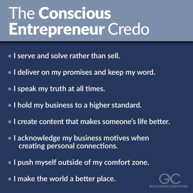
Get more clients, grow your business, provide non-salesy value, and make the world a better place.
Sound good?
Let’s chat.
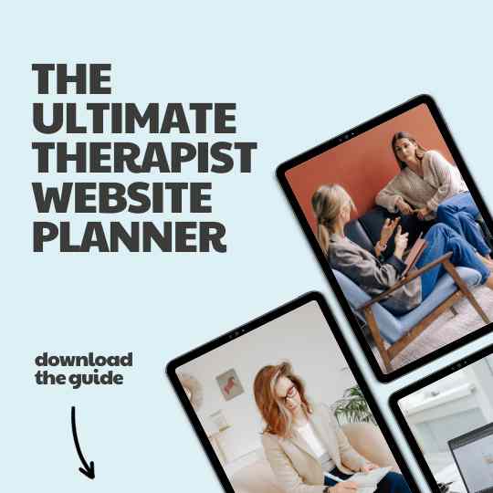
Or, download my free Website Planning Workbook.
Get a Free Website Review
As a way of giving back and helping my fellow entrepreneurs soar, I provide free website reviews to small business owners.
All you have to do is reach out and send me your URL.
In return, you will get a recorded video screenshare analysis of your website where I walk you through some suggested improvements.
Usually, these are simple DIY fixes … or, things your current web designer can take care of.
There’s no sales pitch.
I just love sharing my knowledge.
That said …
If you do happen to need a new website, I would be honored to help you.
As a web designer and coach, I excel at helping you create an effective and beautiful website. One that connects deeply with your dream client and inspires them to reach out.
My approach is compassionate, professional, and includes as much hand-holding as you need.
You can learn more about how it all works here.
Hope to hear from you soon.
~ Greg Goodman

